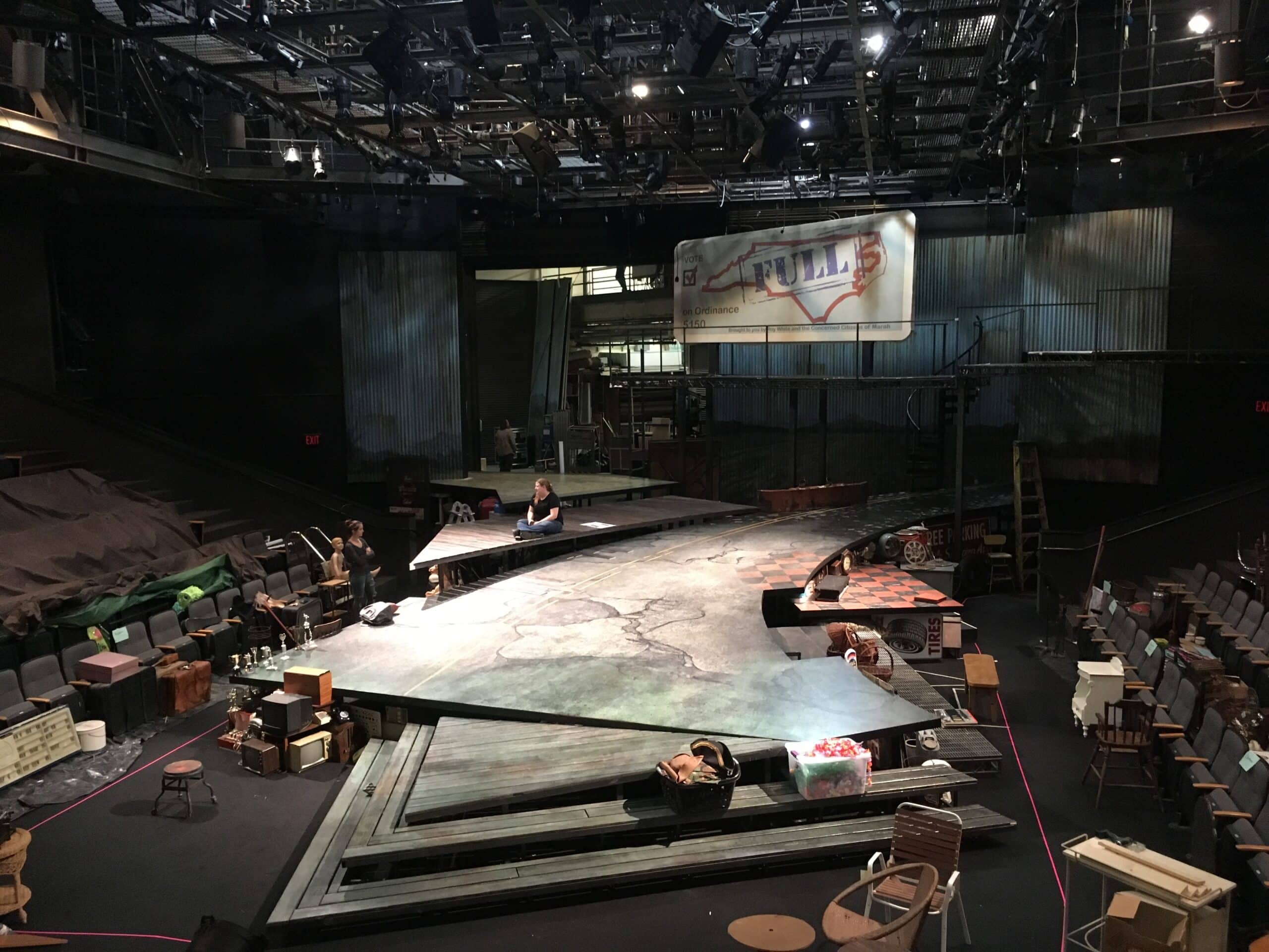
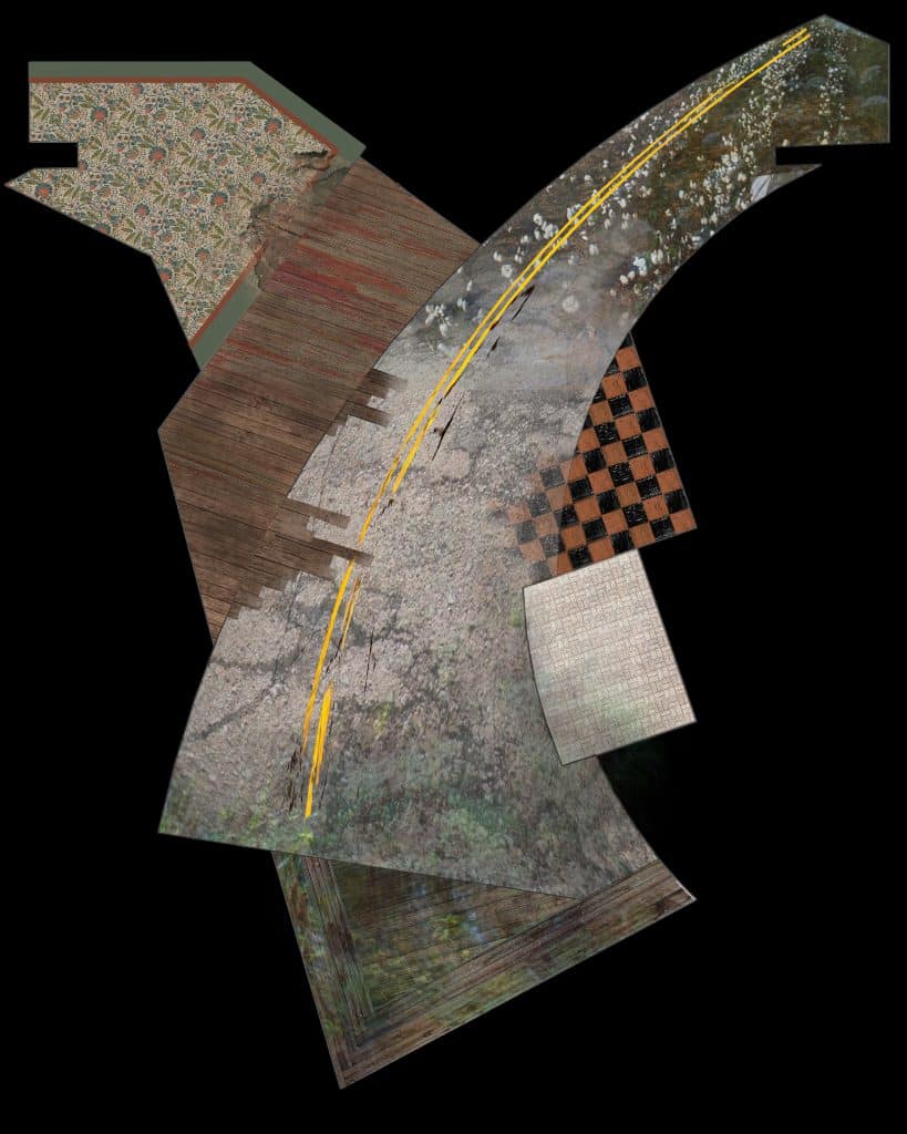
 One of the many models Scenic Designer Jan Chambers provides for the production team is an arial view of the deck like this one—a bird’s eye view of what the paint treatment should look like all over the stage. It’s Scenic Charge Jessica Secrest’s responsibility to take this drawing and make it a reality. As you can see, this set requires a wide variety of paint treatments.
“The stage is sort of multiple locales delivered in a unit way,” said Jan, “You can see the road sweeping in from the cotton fields, you can see the red and black tile of the barbershop. You can see the patterned linoleum of the old houses, you can see the porch floorboards stained with blood, and when you get the the bottom you can see this overlay of just swamp. And there’s also this industrial rubber matting and steel ramp for the factory.”
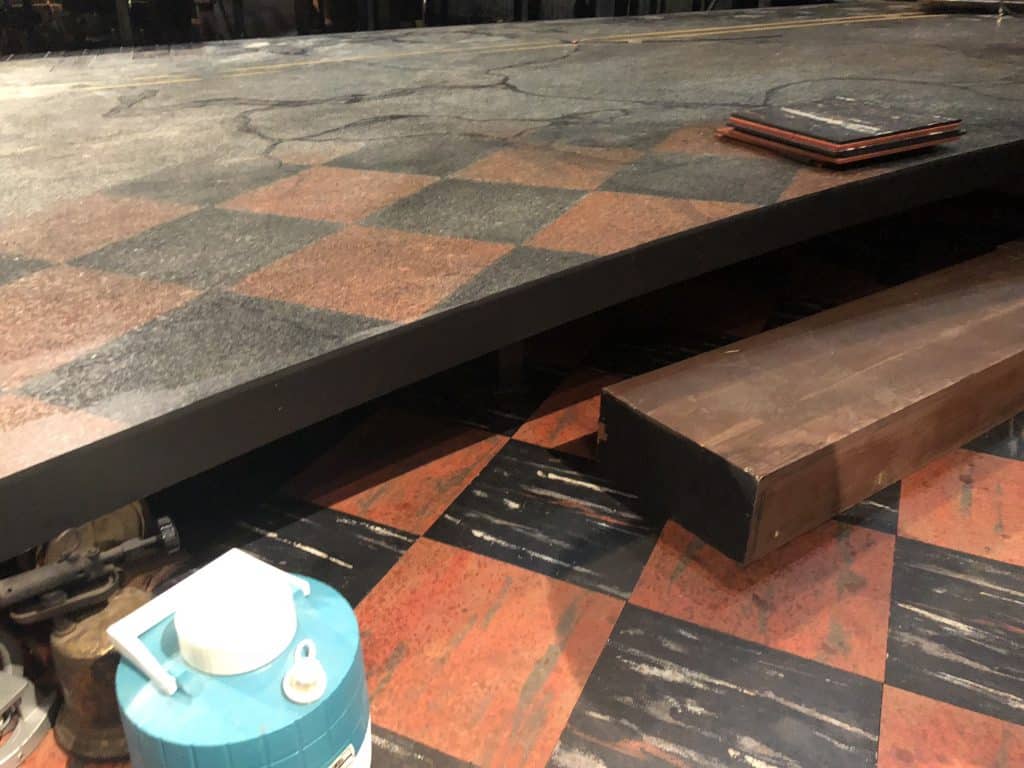
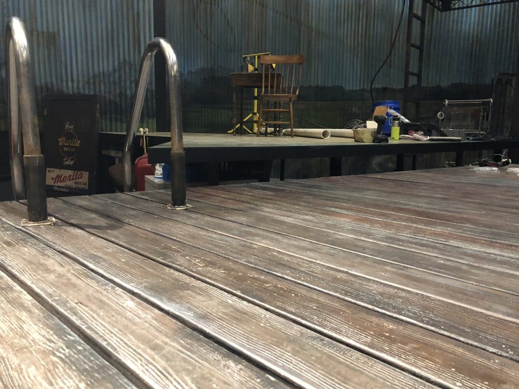
But each area isn’t isolated. You can see above how the paint treatment of the barbershop tile spills out into the road. Jessica and her team of scenic assistants have hand-painted the decking to look like tile, and while each board on the porch is real North Carolina pine, they’ve added additional texture and a deeper color to suggest age.
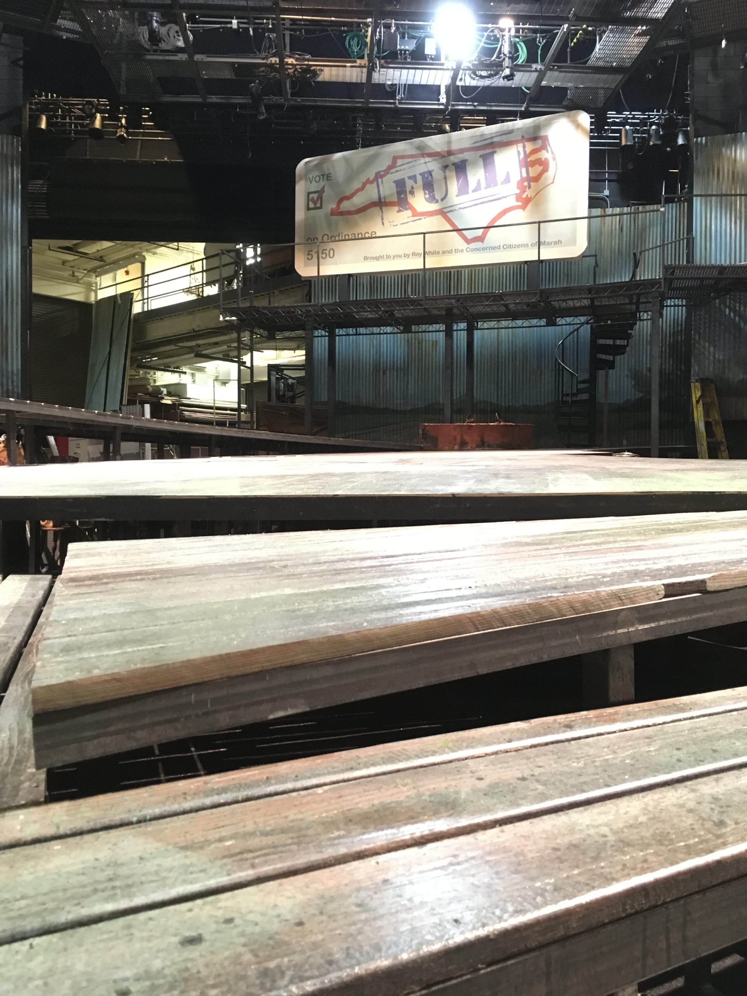
Below you can see how our scenic carpenters have inlaid the deck with identically-painted lauan, so that the wood of the “porch” that edges it’s way into the road actually ends up flush with the road itself, completing the illusion without causing a tripping hazard.
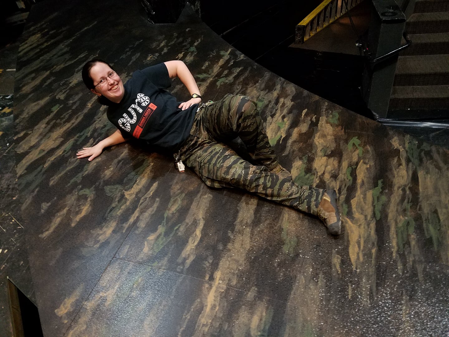
Then, of course, there’s the centerpeice: the large expanse of a tobacco road, sweeping out at the audience as inexorable as history itself. Jan achieved the dynamic feel with the road by designing it on a rake, declining 3/4-inch per foot as it approaches the audience. (Traditionally, most stages were raked like this, which is where we get the terms upstage and downstage.) You can see how the paint treatment begins upstage in cotton fields, which first got a layer of paint that caused ATD Laura Pates’ legs to disappear.
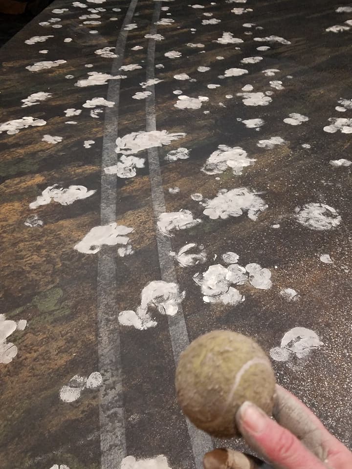
But how to reproduce those fluffy gatherings of cotton? While the undergraduate assistants were all about trying to use a paintball gun, after some testing, Jessica settled on a less controversial, but still fun method. Tennis balls!
As the road continues towards the audience, the asphalt begins to crack and tumble into the river. Jessica drew each crack by hand using a piece of charcoal tied to the end of a long stick, then hand-painted each one in multiple shades of various colors for a realistic shadowing effect.
Gradually the pavement begins to look more watery as it spills into the downstage platform: a dock of sorts, with varying levels of silty greens and blues.
“If any of you have ever been to southeast North Carolina, you know the rivers are not pretty there. It’s more like swampland. They have alligators and you don’t want to fall into one.”
Jan Chambers, Scenic Designer
You can see how this final platform all the way downstage continues the dynamic feel of the road, but with a contrasting rake towards the left side of the audience. And over the entire set looms Marah, North Carolina’s billboard. Through the magic of lighting, this giant billboard will transform to help indicate whether a scene is set in 1933 or 2016.
Join us next week to see the delightful mess that props makes of the stage and the final product under Mary Louise Geiger’s incredible lighting design!
Get your tickets to Mike Wiley & Laurelyn Dossett’s Leaving Eden, on stage April 4–22.
Enjoyed this post? The behind the scenes look continues with props in Part III of our Getting to “Eden” series. Or see Part I to take a peek at the design process itself.
